Timeline
September - December 2020
September - December 2020
Team
Sara Choi and Ariya Feng
Sara Choi and Ariya Feng
Role
UX Researcher and Designer
Platform
Figma
UX Researcher and Designer
Platform
Figma
Problem
Current situation
College students who live off-campus have to cook for themselves because they aren’t on a meal plan with their university. This transition to independent adult life is difficult to adjust to, so my team's project aimed to make meal preparation easier for this user group who may not know how to efficiently use their groceries or plan regularly scheduled meals, which could lead to food waste and unhealthy eating habits.
Current solution space
Current solution space
Grocery delivery services like Thrive Market, Misfits Market, and Instacart are popular among students because they make grocery shopping convenient, but they don't help users figure out how to efficiently use the food they just bought.
Apps like Paprika, MealBoard, and PlateJoy offer users a convenient hub of tools such as grocery lists, recipe collections, ingredient prices, and digital inventories. They're great for people who know exactly what they're looking for, but not for students who have no idea where to start and need more guidance.
The most direct solution might be meal kit delivery services such as HelloFresh, Sun Basket, and Blue Apron, which send customers pre-portioned ingredients to reduce preparation time. They seem like the perfect solution, but users typically don’t get to choose the sources of the ingredients included. The tradeoff for greater convenience is less control over the nutritional value of their meals, and these services are often out of budget for college students.
User research
My research partner and I interviewed Cornell students living off-campus, mostly third and fourth-year students in collegetown, about how they get their meals and what they want to do differently.
Objective
Our goal was to identify key pain points in the meal preparation process by answering these questions:
• What parts of the meal preparation process do users find helpful or enjoyable?
• What barriers do users face when ensuring they're eating well?
• What information do they need to prepare meals for themselves?
• How does the pandemic influence their dining decisions?
Research synthesis
Trends
• Participants often forget they have certain items in their fridge and don't remember until it's too late.
• Participants try to set a budget when grocery shopping.
• Participants tend to eat more regularly and healthily at home than when on campus.
• Most participants feel that access to transportation is a limitation for them when grocery shopping.
Emma
Persona
Emma is a junior at Cornell University living off-campus for the first time in an apartment. Juggling her academics and extracurriculars, Emma also cooks most of her own meals and buys groceries every week.
Emma is a junior at Cornell University living off-campus for the first time in an apartment. Juggling her academics and extracurriculars, Emma also cooks most of her own meals and buys groceries every week.
Goals
In adjusting to independent living, Emma tries to stay healthy by maintaining a balanced diet. She wants to carefully consider the food she eats and plan ahead to save time and money but is also interested in experimenting with new recipes.
In adjusting to independent living, Emma tries to stay healthy by maintaining a balanced diet. She wants to carefully consider the food she eats and plan ahead to save time and money but is also interested in experimenting with new recipes.
Pain points
Emma has limited time to cook meals and wishes the preparation process didn’t take so long. Because of this, she relies heavily on frozen items and tends to make the same meals because they’re convenient. She still buys fresh produce but often forgets she has it in her fridge.
Emma has limited time to cook meals and wishes the preparation process didn’t take so long. Because of this, she relies heavily on frozen items and tends to make the same meals because they’re convenient. She still buys fresh produce but often forgets she has it in her fridge.
User flow
I drew up a chart to track users' general steps in their meal preparation process and identify potential places for technological intervention.
User flow
Feature
While we couldn't provide a way to eliminate or expedite the physical labor of preparing ingredients, we developed a solution to save users time (and money) in the next most time-consuming stage of meal preparation. Participants often complained about how long it takes them to decide what to cook using the groceries they currently have, so we designed the app to recommend recipes based on a user's current inventory.
Concept
Concept
The app was originally called "Rethink Ramen" for our class submission, but our TA advised us that the name would lead prospective users to think it's only about ramen rather than general meal preparation.
After the semester ended, I continued user testing on my own to rebrand and more effectively communicate the purpose of the app. I preserved the main features of the original app and created explorations to find the most intuitive and impactful visual layouts. All images (except the apple pie recipe and grocery stock images on shopping pages) were taken by me.
Original screens
Original screens
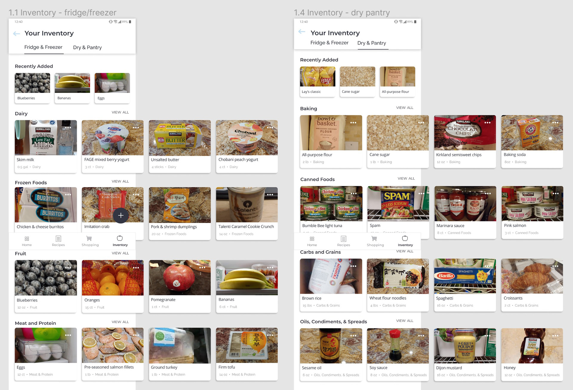
Inventory tabs
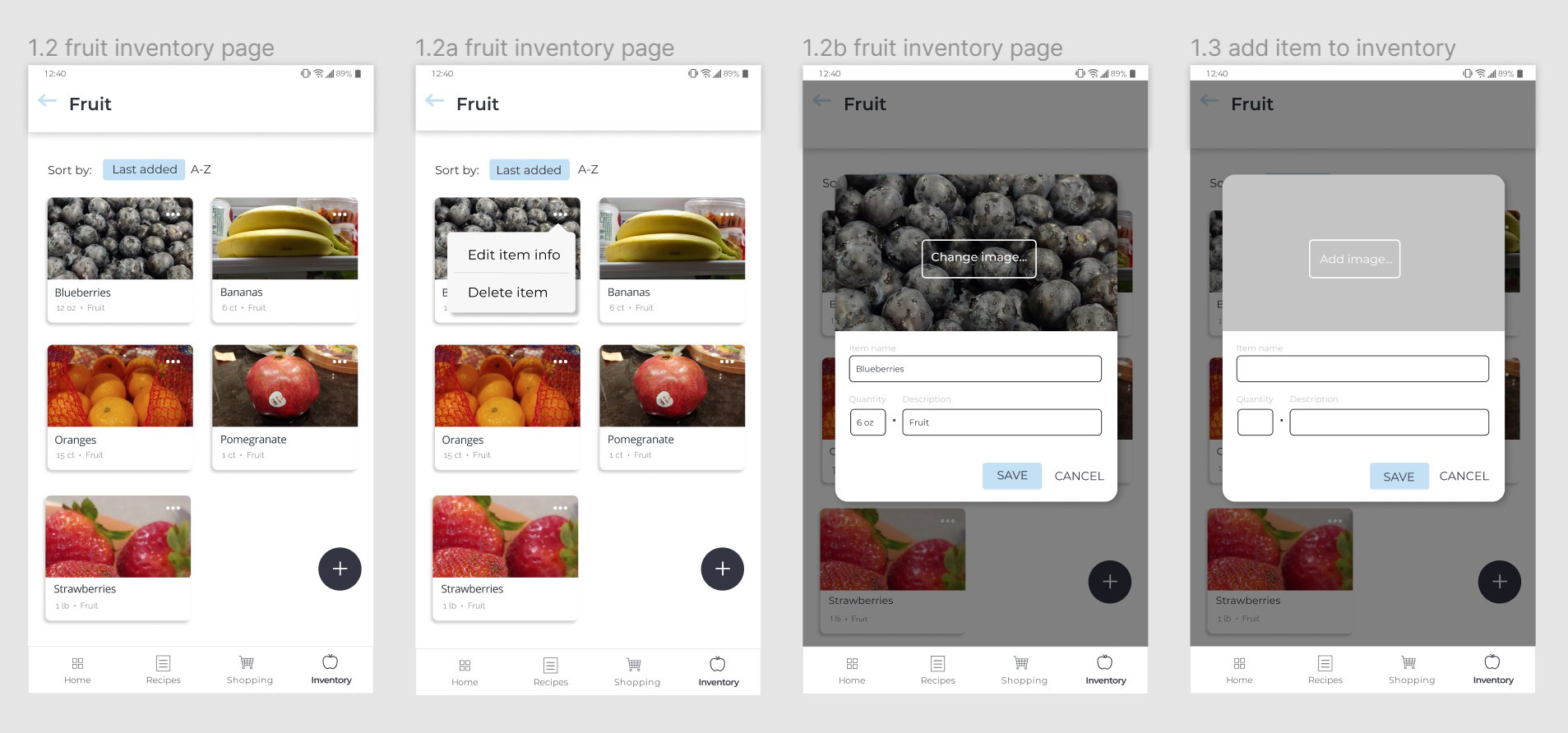
Category pages and edit menus
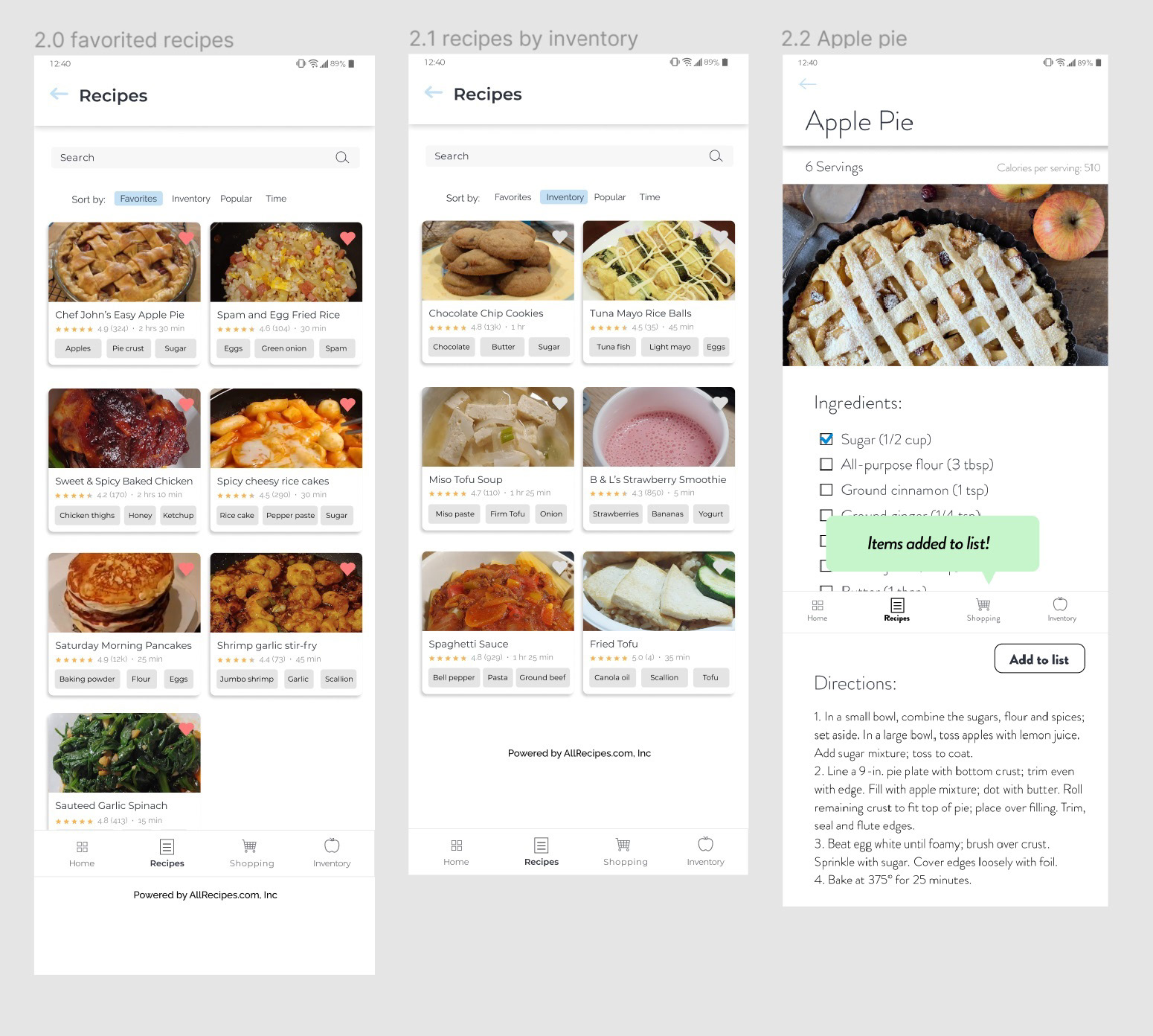
Recipe finder
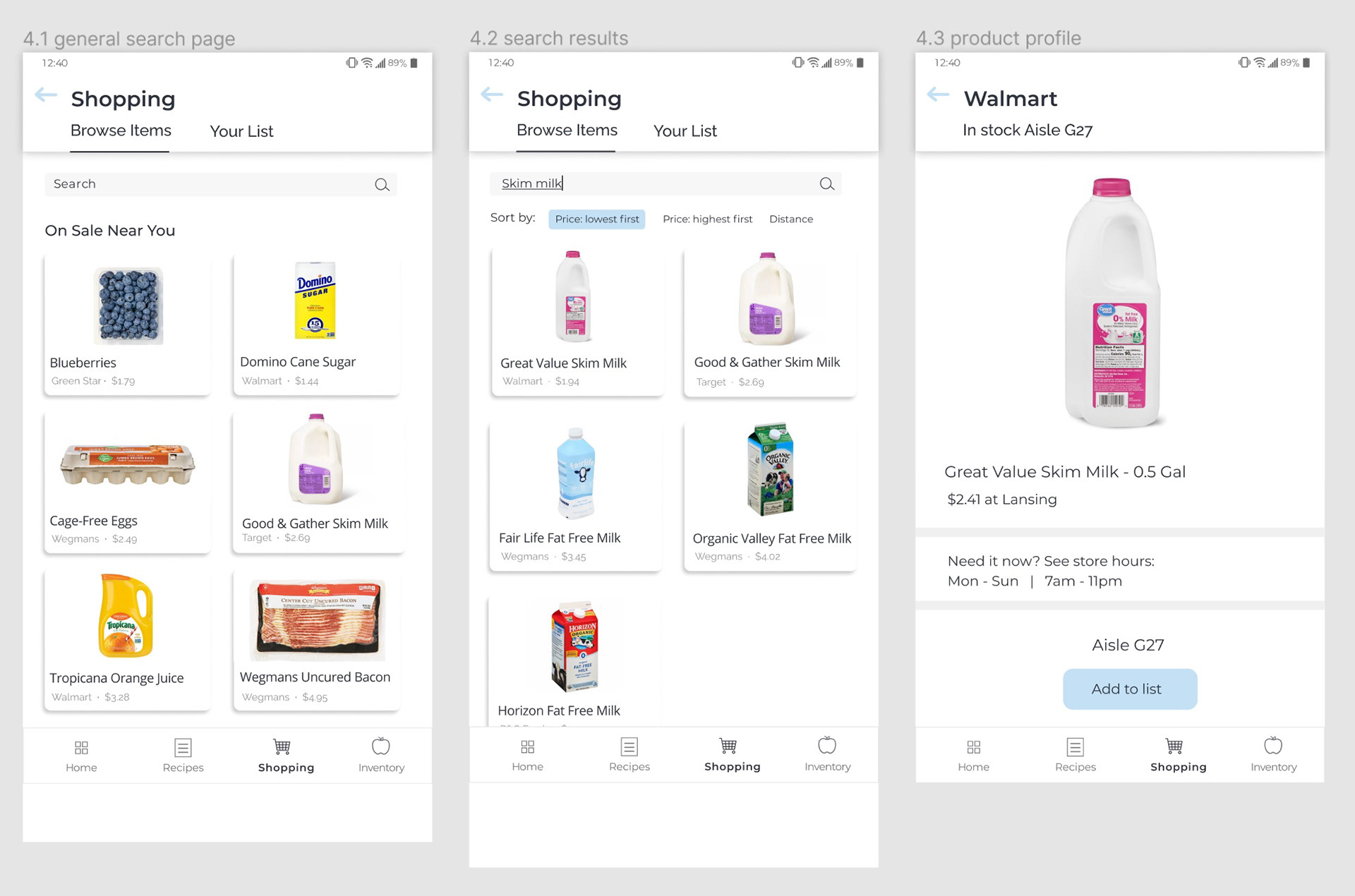
Grocery price database
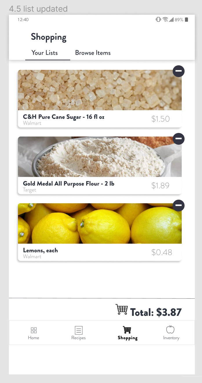
Shopping list
Redesign
I grew up eating, cooking, and sharing Korean food, so I renamed the app "Jango," or short for "naengjang-go," which means refrigerator in Korean. Emphasizing the "go" at the end in English is a (corny) nod to the mobile nature of a user's digital fridge on the app. My pun policy? Always intended.
Home screen
Personalized greeting provides a friendlier experience.
"Expiring Soon" section highlights unused groceries.
Lunch suggestions for recipes are generated from the user's current inventory to reduce food waste.
Personalized greeting provides a friendlier experience.
"Expiring Soon" section highlights unused groceries.
Lunch suggestions for recipes are generated from the user's current inventory to reduce food waste.
View and edit digital inventory
Inventory section tabs
Toggle tabs allow for switching quickly between fridge or freezer and pantry sections.
The "Recently Added" row reminds the user of their most recent grocery trip.
The interface shell uses a gray container with white modules to mimic fridge shelves.
Categories are sorted alphabetically.
The floating "add item" button can be moved out of the way when scrolling.
The card layout allows for clear organization.
Individual category pages
No tabs are necessary for individual category pages.
Users can sort entries by most recently added or alphabetically.
The dropdown action menu is housed in the overflow menu to conserve screen space.
The optional "edit quantity" form field accommodates different users' organization preferences.
Users have the option to add an item image for easy recognition.
The "Save" CTA is styled as the primary button to easily distinguish it from the "Cancel" button.
Browse, save, and view recipes
Recipe finder
• Search bar for users who don't want to browse
• Sort results to see most relevant recipes first
• Favorites icon in upper right-hand corner of card to quickly add a recipe
• Average star ratings and number of reviews to leverage social proof
• Total preparation and cook time to let user plan ahead
Recipe page
• Large center image for user to see what they're making
• Recipe scaler to automatically adjust ingredient amounts
• "Add to list" feature to add missing ingredients to shopping list
• Footer to tell the user where the recipes are from
• Large center image for user to see what they're making
• Recipe scaler to automatically adjust ingredient amounts
• "Add to list" feature to add missing ingredients to shopping list
• Footer to tell the user where the recipes are from
Compare grocery prices
Grocery price database
• Search bar to quickly look up and compare prices at different stores
• Sort by price or distance to see most relevant results first
• Product images show what to look for (or avoid) at the store
• Store names and prices provide relevant information for convenient comparison
• Toggle tabs to separate different functions within the shopping feature
Product page
• Large center image creates visual focus on product
• Store stock status, aisle, and store hours provide relevant shopping information
• "Add to list" feature serves as a timely and useful CTA
• Large center image creates visual focus on product
• Store stock status, aisle, and store hours provide relevant shopping information
• "Add to list" feature serves as a timely and useful CTA
Shopping list
• Toggle tabs
• Moveable list items for easy reordering
• Split list to separate checked items from unfinished ones
• Manually add a list item separately from grocery product page
• Existing entries are editable
• Moveable list items for easy reordering
• Split list to separate checked items from unfinished ones
• Manually add a list item separately from grocery product page
• Existing entries are editable
Visual design
Navigation bar icons
Decision: Option B
In user testing, participants consistently requested larger navigation bar icons to see the details more clearly.
Some commented that the recipes icon could be better represented with a graphic more closely associated with cooking. I changed the paper document to a whisk, which users appreciated in the second round of testing.
Overflow menus
Decision: Option B
The touch target area of the overflow menu icon with unfilled circles was too small and created a pain point for almost all participants during user testing.
Users had an easier time clicking on the icon with filled circles, but two still found it frustrating.
I prototyped a larger touch target for the icon, and that solved the issue for all users.
Checkboxes
Decision: Option B
Green checkmarks indicate success and signal the user to continue. Users are accustomed to using them for marking list items as done, but the purpose of the ingredient list feature is to mark what the user doesn't have, not what they have.
Red X's effectively tell the user to stop but may come across as alarming.
Red checkmarks weren't a viable option during user testing. Participants still mistook the checkmarks to mean they had the selected ingredients.
UI kit
The following kit contains key elements of the visual identity for Jango.
The following kit contains key elements of the visual identity for Jango.
Jango UI Kit
Takeaways
Creating Jango, formerly known as Rethink Ramen, was a great experience for learning to "trust the process" even though the idea of 0-to-1 design was almost inconceivable to me. Not to say app redesigns are easy, but at least their features have already been vigorously tried and tested within the industry. I just didn't know how I was supposed to figure that out for an app that didn't even exist yet.
The answer was to measure that success myself. Accurately extracting insights from trends in interview responses and translating those insights to actionable, impactful design tested my critical thinking skills. Through the continuous drafting, revising, and iterating, it was gratifying to see how effective this process was for getting to know my users and designing a solution for their meal planning struggles. Check out my final interaction in the video below!