
Timeline
June 2022 - August 2023
June 2022 - August 2023
Team
Content designers: Sara Choi, Allison Biesboer
Accessibility SME: Imranali Khaja
Inclusive design SME: Dee Miller
Researchers: Madison Colvin, Daniela Chavez, Zena Getachew
Content designers: Sara Choi, Allison Biesboer
Accessibility SME: Imranali Khaja
Inclusive design SME: Dee Miller
Researchers: Madison Colvin, Daniela Chavez, Zena Getachew
Role
Visual designer, content designer
Visual designer, content designer
Platform
Figma
Figma
Background
Nova is the most recent release of Visa’s internal design system for digital payment experiences. I joined the design system team as a content designer to create a space for content guidance and advocacy within the some 20-odd PDF pages of design and development best practices at the time. Past iterations had been put together as a collection of disjointed initiatives to create more robust and comprehensive guidance, and content across the board was sorely in need of a cohesive structure, intuitive organization, consistent voice and tone, and a more easily digestible format.
In the early stages of the Visa Product Design System (VPDS), content design was barely represented. At the time, a more senior colleague had drawn up a brief style guide. Strategically speaking, I could already see how its format as a Word document wouldn't be able to support future scalability and currently offered few affordances for presenting technical guidance in easily consumable ways. For this reason, and others, I pushed to move this initiative into Figma and made a template for a flexible content model with anchor links to accommodate new guidance, including the foundations I co-authored.
Discovery
In Figma, we composed the first official draft of this content style guide on the foundations of accessible, inclusive, and equitable design. With my senior colleague, I wrote guidance on writing rules for grammar and mechanics—emphasizing the importance of sharp, precise communication in products with high-stakes consequences—and developed a broader strategy for teams requesting help with placeholder content and UI labels for their medium-fidelity iterations.
Aiming to avoid creating this style guide for it to circulate briefly then disappear, we designed this document to provide pathways for designers and developers to understand the significance of certain recommended practices and motivate them to reference these guidelines on their own.
While some topics had clearly right or wrong approaches, such as avoiding violent language, others like when to use the passive voice felt less absolute and more up to the discretion of the reader. Even neutral topics felt a little ambiguous or dependent on locale, such as whether to use the Oxford comma. Emphasizing that this guidance was far from finalized and still a work in progress, we decided this was an appropriate point to do our first round of user testing with subject matter experts in relevant employee resource groups (ERGs) within the company.
User research
Objectives
• Determine how representative the "Human" section is of participants' lived experiences and the work they do, and how closely it aligns with their existing knowledge.
• Understand how inclusive the language and terminology used throughout the guide is to different identity communities.
• Uncover how the guide represents the way participants think about people-first language.
• Understand how inclusive the language and terminology used throughout the guide is to different identity communities.
• Uncover how the guide represents the way participants think about people-first language.
Methodology
The research team conducted two moderated 60-minute workshops with members from Visa's ViAble and PRIDE employee resource groups. Participants were asked to review portions of the Human section of the content style guide in collaborative FigJam activities. ViAble ERG members reviewed content related to ability, while PRIDE ERG members reviewed content related to gender, gender identity, and orientation.
Questions
• Based on your lived experience or work that you do, can you see yourself represented in this content?
• Does this content represent the way you think about people-first language?
• Is there anything you'd like to change, or is anything you'd expect to see missing from this guide?
• What other thoughts would you like to share?
• Does this content represent the way you think about people-first language?
• Is there anything you'd like to change, or is anything you'd expect to see missing from this guide?
• What other thoughts would you like to share?
Research synthesis
Trends
• Participants wanted more detailed guidance on how to apply rules and exceptions to Visa products.
• Participants were confused about why some examples included in the style guide didn't reflect person-first language.
• Participants expressed excitement Visa was putting in the effort to be inclusive in the content we produce and distribute.
• Participants want to use this document to educate colleagues and bring them along the journey.
• Participants provided iterative feedback to bring the content team a deeper understanding of their perspective.
• Participants generally felt overwhelmed by the amount of content.
Key insights
• Participants understood when exceptions applied if disclaimers were placed at the beginning of their relevant section, not at the end. They expressed confusion when asterisks denoting disclaimers were difficult to find.
• Participants wanted to ensure that terminology would be regularly updated as language changes in these communities.
• Participants expected to see more examples demonstrating how the style guide would be used in the context of Visa products and applied to business scenarios.
• Participants wanted additional resources linked for further learning.
• Participants felt seen in the examples provided for the gender identity section and appreciated they were equitable and didn't follow typical gender stereotypes.
• Participants were impressed by the accuracy of the terminology and examples used in the Descriptive Terms section.
• When self-identifying gender, participants reported feeling that radio buttons didn't provide the flexibility they expected but appreciated the variety of options provided and the removal of the "other" option.
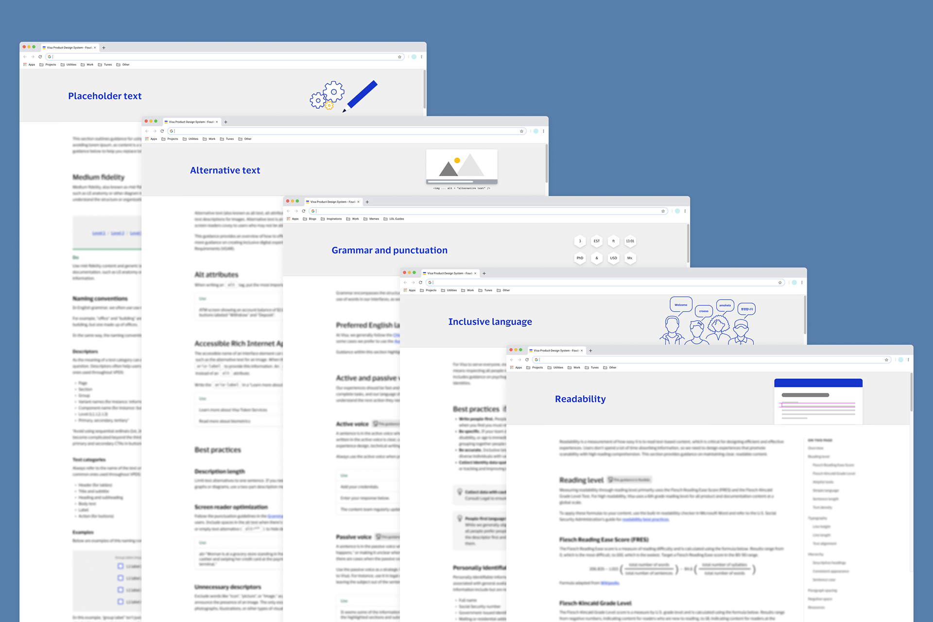
I co-authored these five pillars in the VPDS content style guide: Placeholder text, Alternative text, Grammar and punctuation, Inclusive language, and Readability.
Content decisions
Synthesis and action plan
Based on feedback gathered from this first round of user testing, we identified action items as either global changes—creating standards or conventions to apply to the entire guide—or sectional changes—specific details within a section to edit or revise.
A common theme we identified in participants' confusion concerned when it was acceptable to bend the rules or how rigid certain recommendations were. To remedy this, I created visual markers labeled as "fixed" for sections with non-negotiable guidance that must be followed and "flexible" for anything the company didn't have a particular point of view on.
We were aware the guide would grow, although evidently it surpassed our expectations. We decided it would be more scalable to separate individual topics or subjects into their own "foundations" housed under the Content foundation within the design system. This significantly reduced the number of layers or levels for our section headings and made it easier for readers to orient themselves within the experience.
The current version of the Content foundation has graduated from Figma and now lives in its own navigational category on the Visa Product Design System internal site, complete with accessible webpages and a separate Accessibility (a11y) foundation I co-authored with our A11y team lead.
Updates
While I've since moved on from our design system team, I knew I was leaving this work in the very capable hands of my content design colleagues Brandee Dudenhoefer, Meghan Bhenke, and most recently Chine Okeke under our fearless leader Allison Biesboer.
Showcasing content design guidelines in the Visa Product Design System
In collaboration with our development, visual design, accessibility, and design ops partners, they've transformed our internal documentation into a full-fledged public design system web experience as one of the first of its kind to showcase content as an integral part of product design. Check out the Visa Product Design System to explore the results of a years-long effort to take this open source.